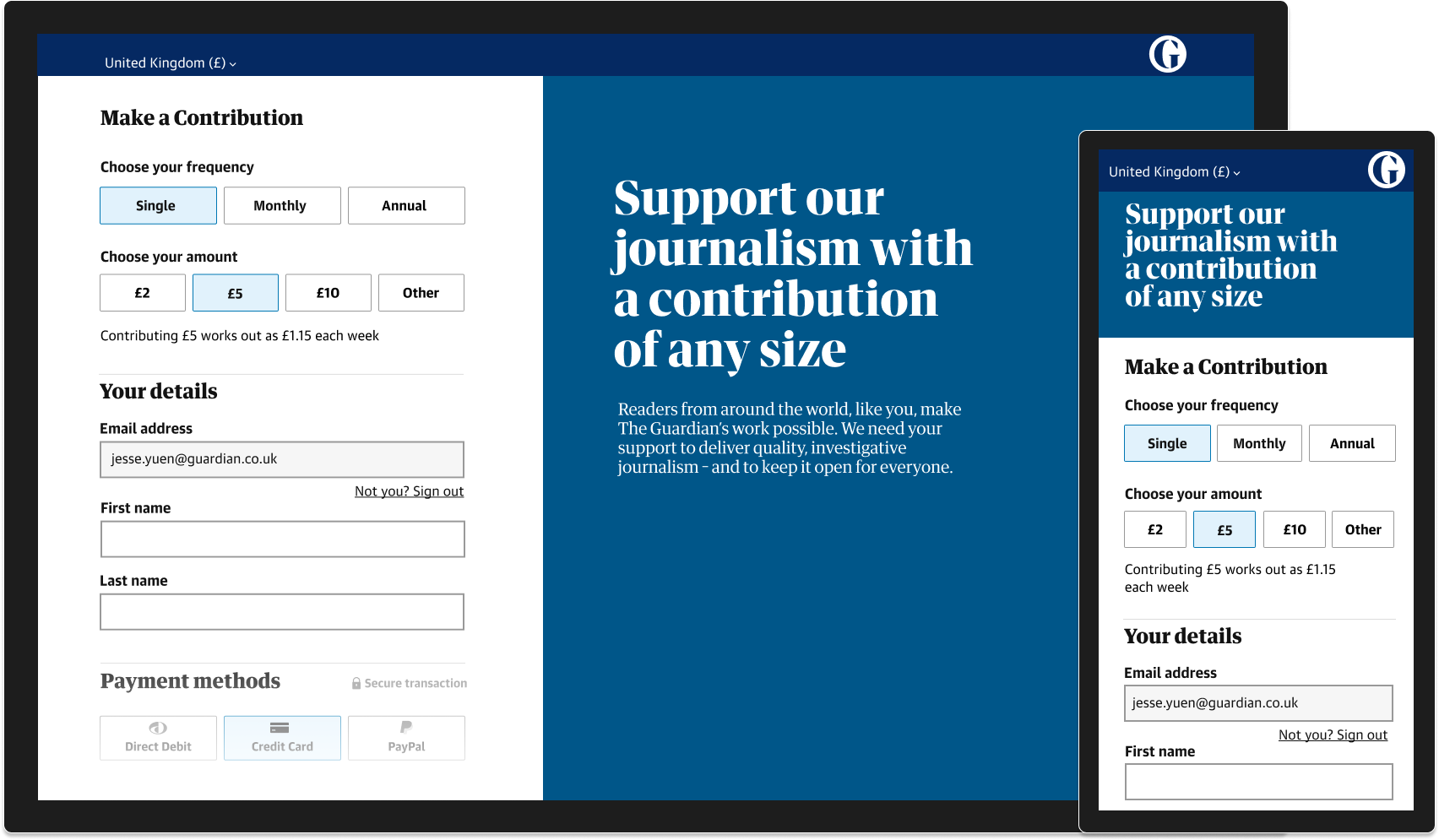
The Guardian does not have a paywall and instead relies on readers’ contributions and subscriptions as a large part of its funding model. The Contributions team’s roadmap understandably revolved around maximising revenue for the Guardian.
Often user needs and business needs are complementary and in this project I felt there was a need to advocate for user focused work too.
Accessibility audit
My initial piece of work involved running an accessibility audit across the journey which included:
- Manually testing the journey with keyboard navigation
- Manually testing of the journey with a screen reader
- Automated testing for WCAG and validation errors
This was a new process for the team and with them having never run an accessibility audit, plenty of interesting results were uncovered.
It turns out the journey was impossible to complete when using either keyboard or screen reader. Multiple form elements were keyboard traps, trapping focus so the user can’t progress. Other form elements were completely hidden from keyboard and assistive technology users.
Playing this back to the team, it wasn’t hard to convince stakeholders to prioritise fixing these issues. When a product’s primary purpose is to generate revenue, it’s helpful if your user base is as large as possible. Profits aside, I wanted to convey that as creators we have an ethical duty to make the web a positive experience for all users.
Usability review
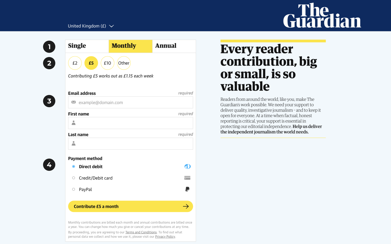
Following was a usability review. For such a small amount of screen real estate, there was A LOT going on.
- We were using a tab pattern to collect contribution frequency. The grail of user interface guidance, the GOV UK Design system docs, state that tabs should “let users navigate between related sections of content, displaying one section at a time.” These look like tabs but are they really? Under the hood they are radio buttons. Are users navigating different content? No, they are just choosing an option.
- More radio buttons! Though these ones look totally different to the previous set of faux-tabs. Why? They also are significantly less prominent to the row above. My hunch was that we should be placing equal visual importance on both contribution frequency and amount options.
- The three text fields were very busy. Was it really necessary to mark each as required? Did we need leading icons to help identify rather generic form fields? Probably not.
- A third set of radio buttons, again with unique styling, although somewhat more traditional. The accessibility audit highlighted that these performed poorly in terms of contrast and also other colour checks.
User flows
Coming soon.
Designing and piloting design system components
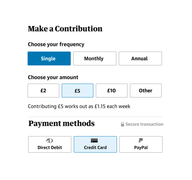
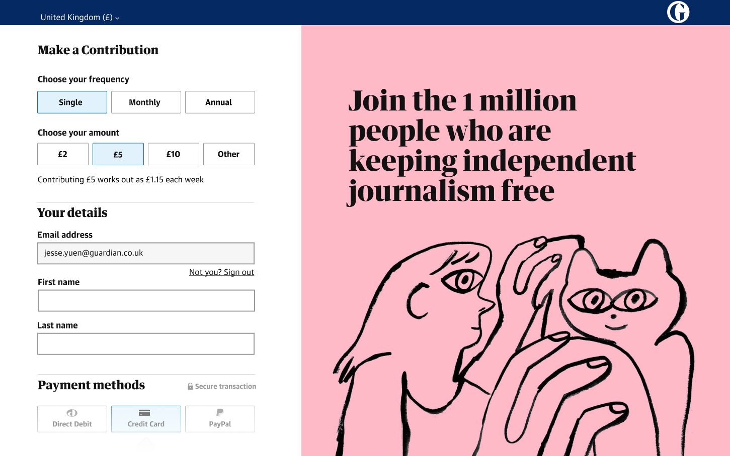
I consolidated the three random radio button styles into one consistent pattern, a UI pattern which we started calling choice cards.
At this time the Guardian Design System was in its infancy and we used this project to publicly pilot the new component and also experiment with the workflow between the product and design system teams.
All three sets of radios, now styled as ‘choice cards’ where also clearly signposted with accessible form labels.
Opportunities for design within constraints
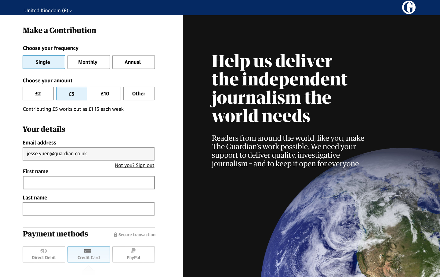
Though much of this design process was focused on simplification we also wanted to accommodate bespoke marketing events at The Guardian. We needed to be able to easily theme the page based on marketing campaigns. The updated design had a generous enough amount of real estate that was flexible in allowing bespoke design opportunities.
Encouraging repeat contributions
Coming soon.
Measuring success
This team was very big on multivariate AB testing. I’m more a ‘let’s stick this in front of users’ and see what they say kind of designer but I recognise the role AB testing can play, especially when the success metric is something easy to measure like revenue. The design contributed to a positive shift in contributions.
More holistic metrics like user experience are much harder to measure and this presents a challenge when getting buy-in from stakeholders for inclusive design.
Outcome
We covered a lot of ground in this piece of work including fixing fundamental accessibility and usability issues, piloting new design system components and visually evolving our contribution journey. The stakeholders were happy with positive revenue gains and our users were given a significantly more usable and accessible experience. I would have loved the opportunity to look further along the journey:
- What does the thank you page look like?
- What do the confirmation emails say?
- How can we encourage users to contribute again?