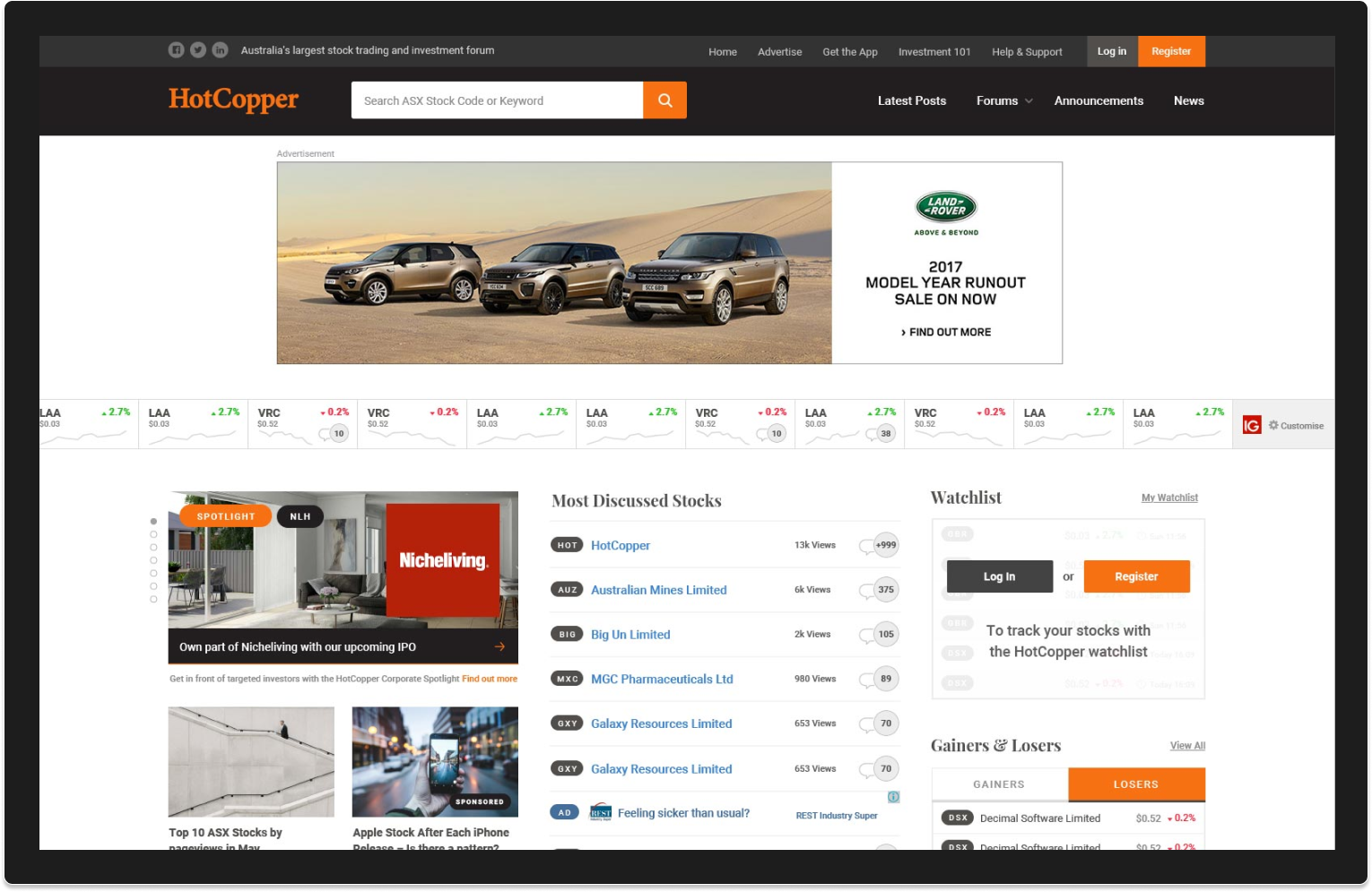
Information architecture and UX review
We began with a comprehensive site-wide audit. Many questions were asked.
What does each page do? What does the UI on each page to do? Does it function as expected? Is it placed intuitively? Do we need it? Are we missing anything? What is broken? What works well?
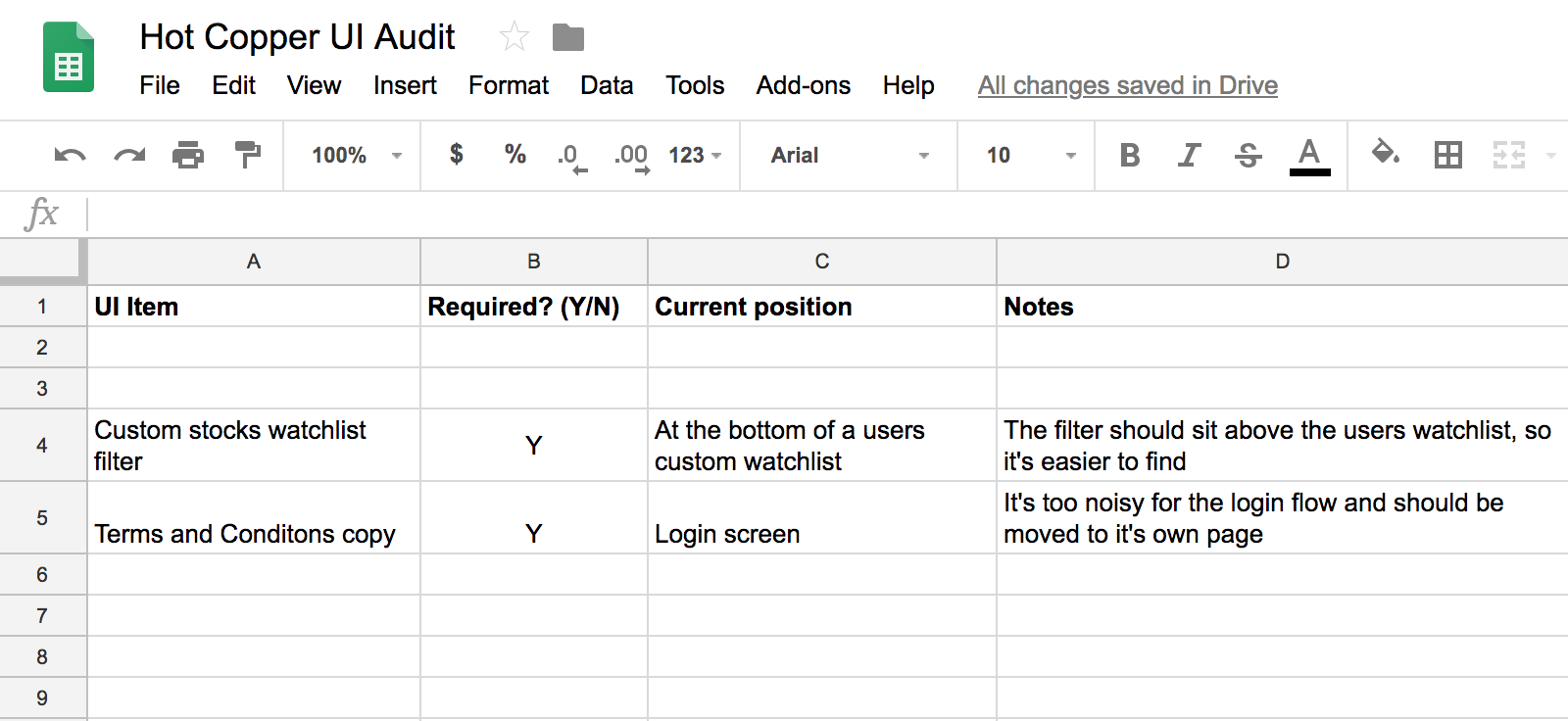
Things that make you go hmmm
Our initial suspicions was that the information architecture was overly complex and contributing to a somewhat confusing experience for people navigating the site. We decided to set up a tree test using Treejack to evaluate how findable key parts of the site where for visitors.
Creating a tree test allows you to see a sites structure without the influence of navigation aids and visual design and in doing so we realised while that the current IA was actually rather rather straightforward and not too much needed to be re-jigged.
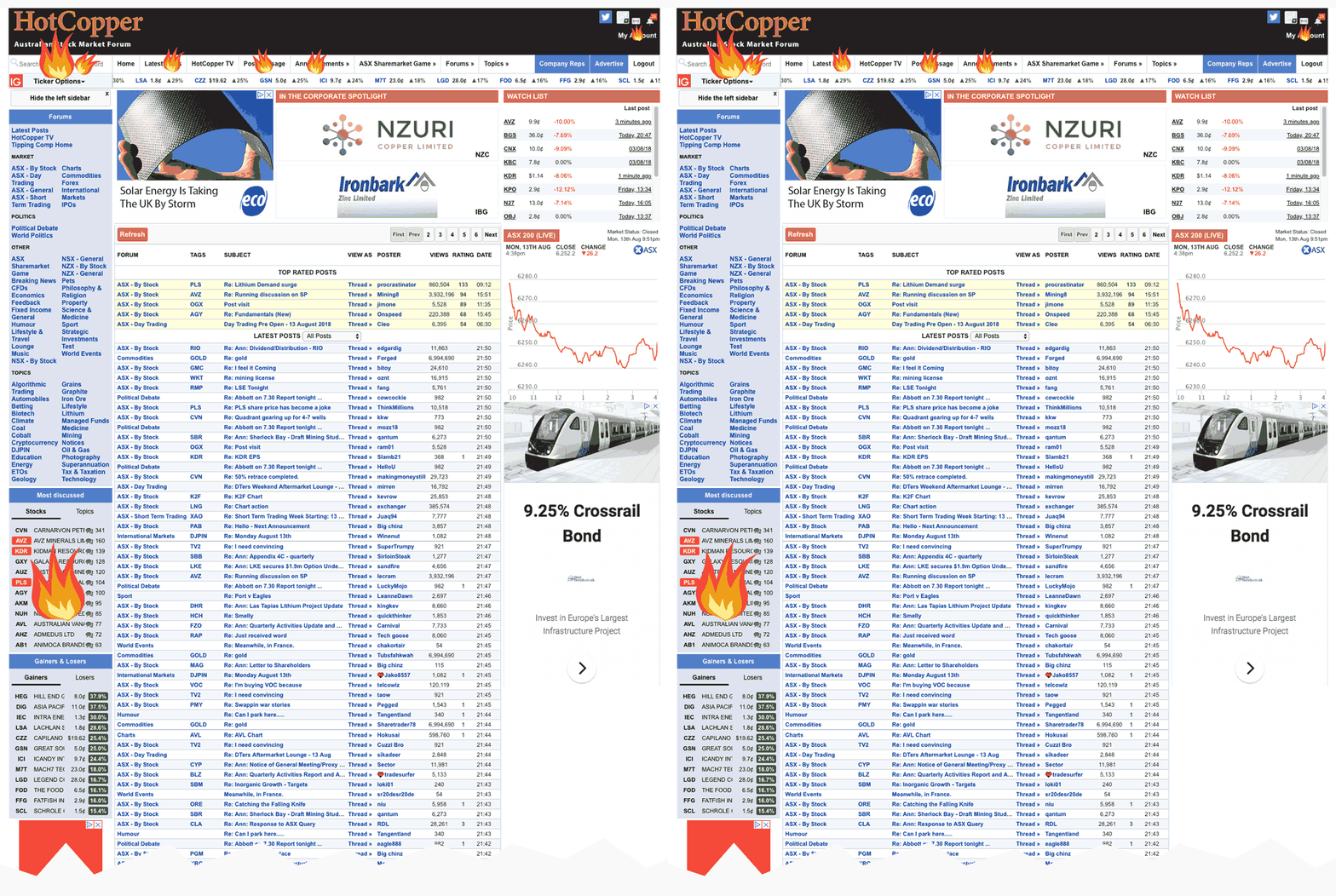
Insight! It wasn’t as much poor IA but rather a limited visual hierarchy and busy UI that gave the impression of cluttered structure, in the process increasing the cognitive load and creating a baffling experience 😕
User research
I conducted interviews with staff in support roles within Hot Copper to help identify common pain points that users experienced on the site. Many of these followed a similar theme of onboarding, account management and forum engagement… all priority tasks for the site.

We didn’t have access to users for interviews in this case so another member of our team ran a site-wide survey gathering 3000 or so responses.
This kind of qualitative data proved very helpful as began problems and patterns began emerging and we could prioritise the ones we hoped to fix and how.
For 2 weeks we ran heat mapping on key landing pages to identify navigation patterns. We discovered quickly that many items occupying space in the primary header region were in fact collecting no clicks whatsoever.
Insight! Only a few links in the header, the search component and an obscure sidebar widget partway down the page appeared to be the primary methods of site-wide navigation for a large amount of users 😮
Interface design
To kick off design I wireframed oodles of screens across viewports and states and captured intended layout for the site based on our research and these informed conversations with internal stakeholders and third-party collaborators such as SEO types.
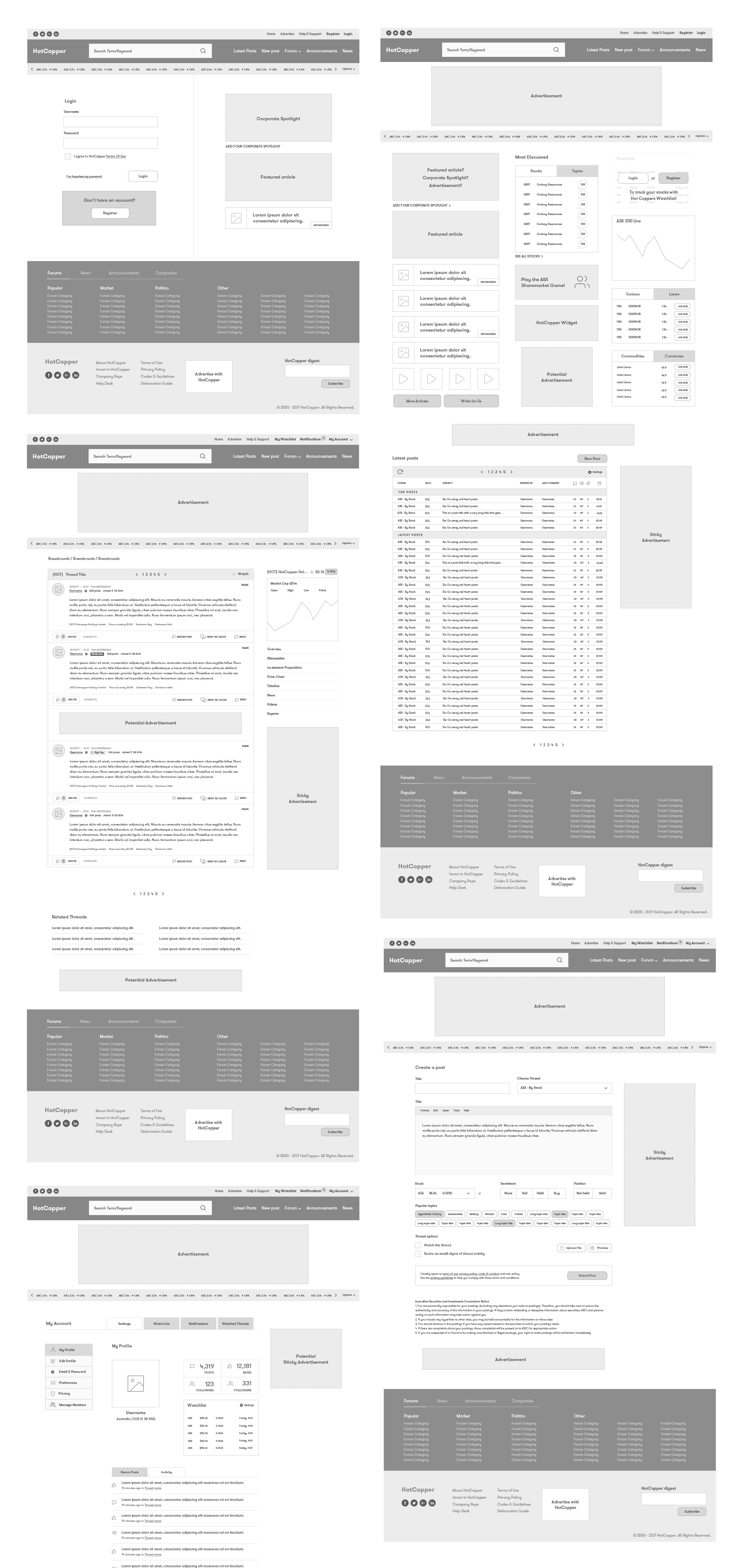
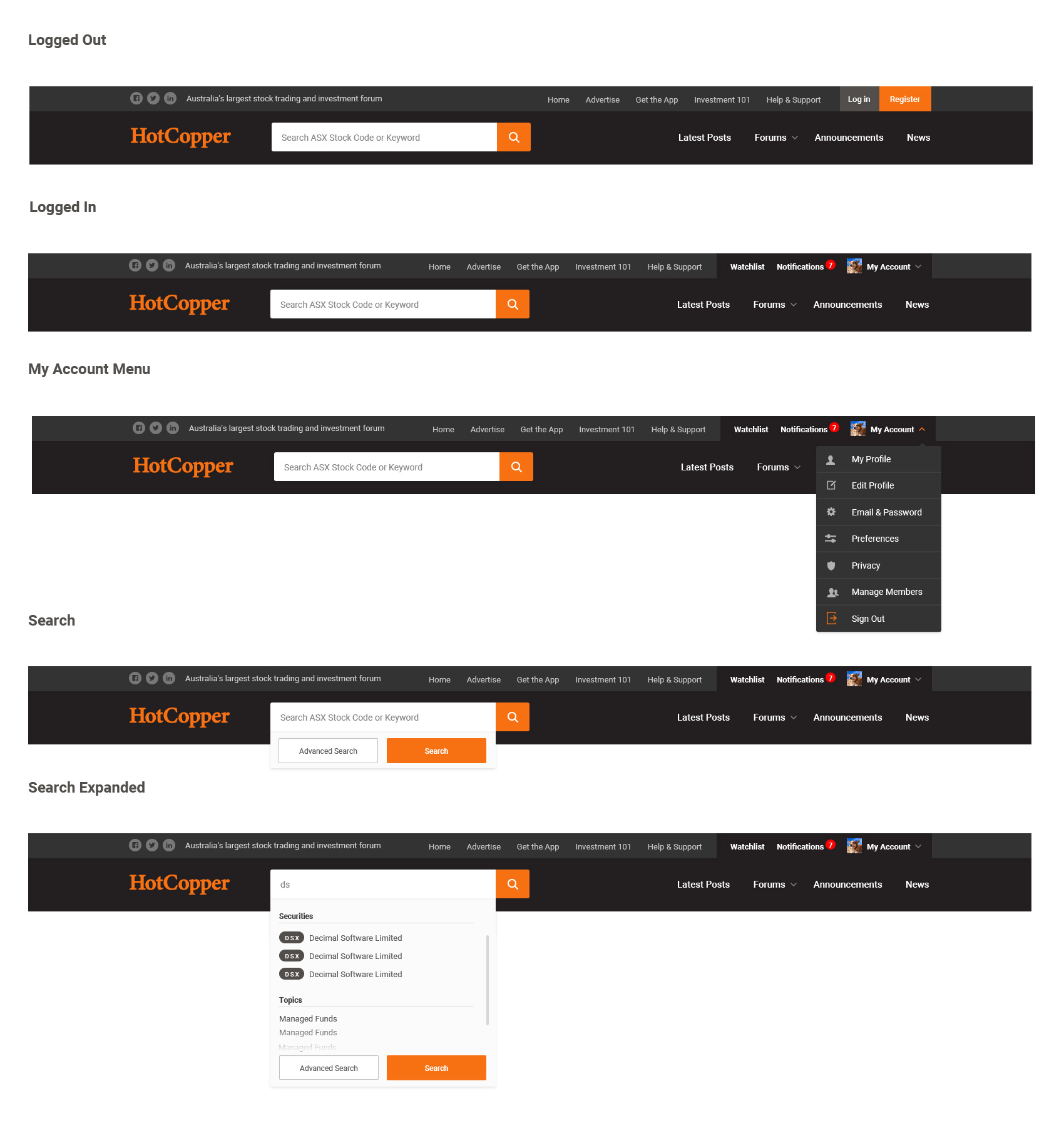
Our final design included a strict audit of links in the header with an emphasis on a prominent search component and clear typographical hierarchy.
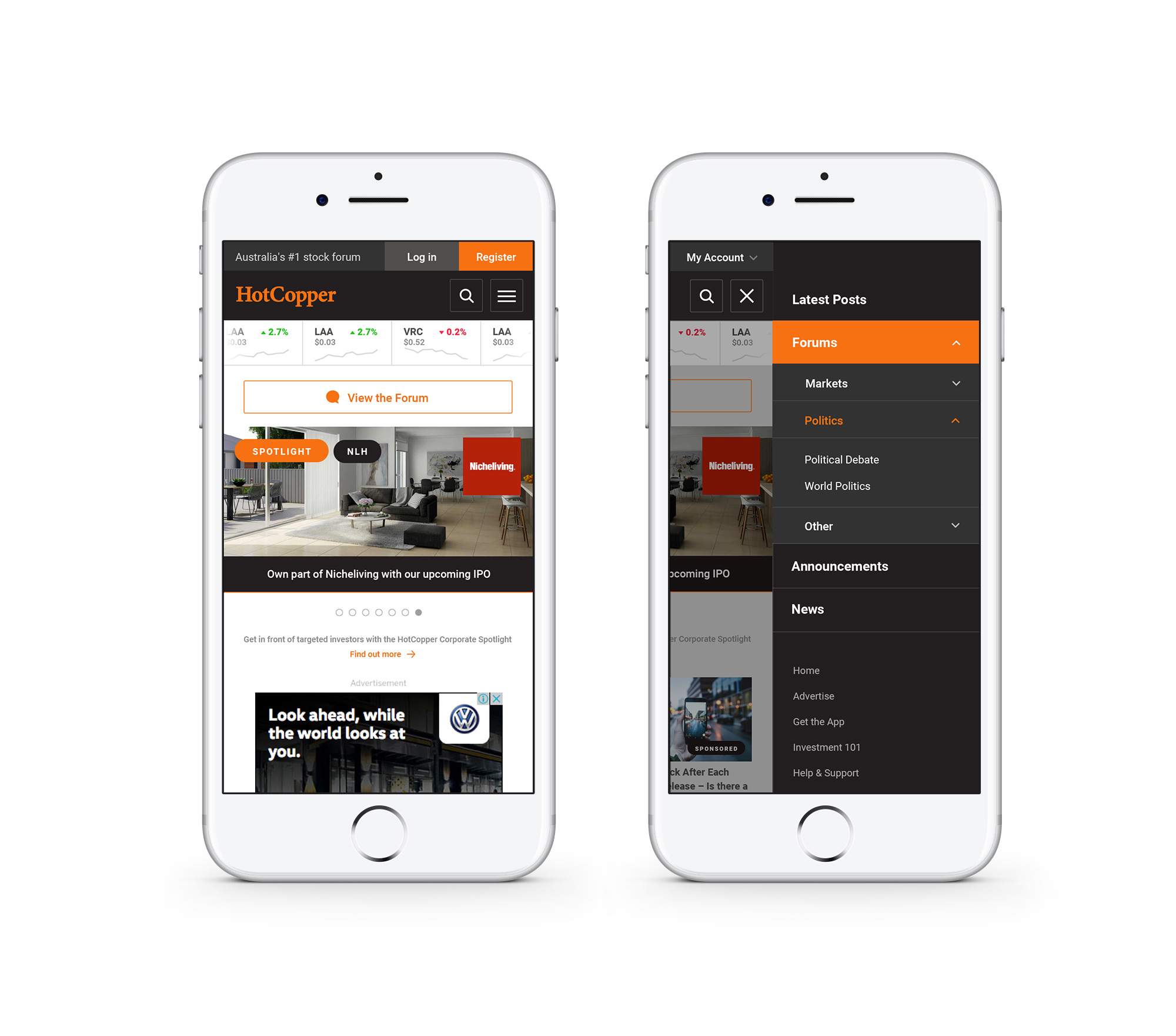
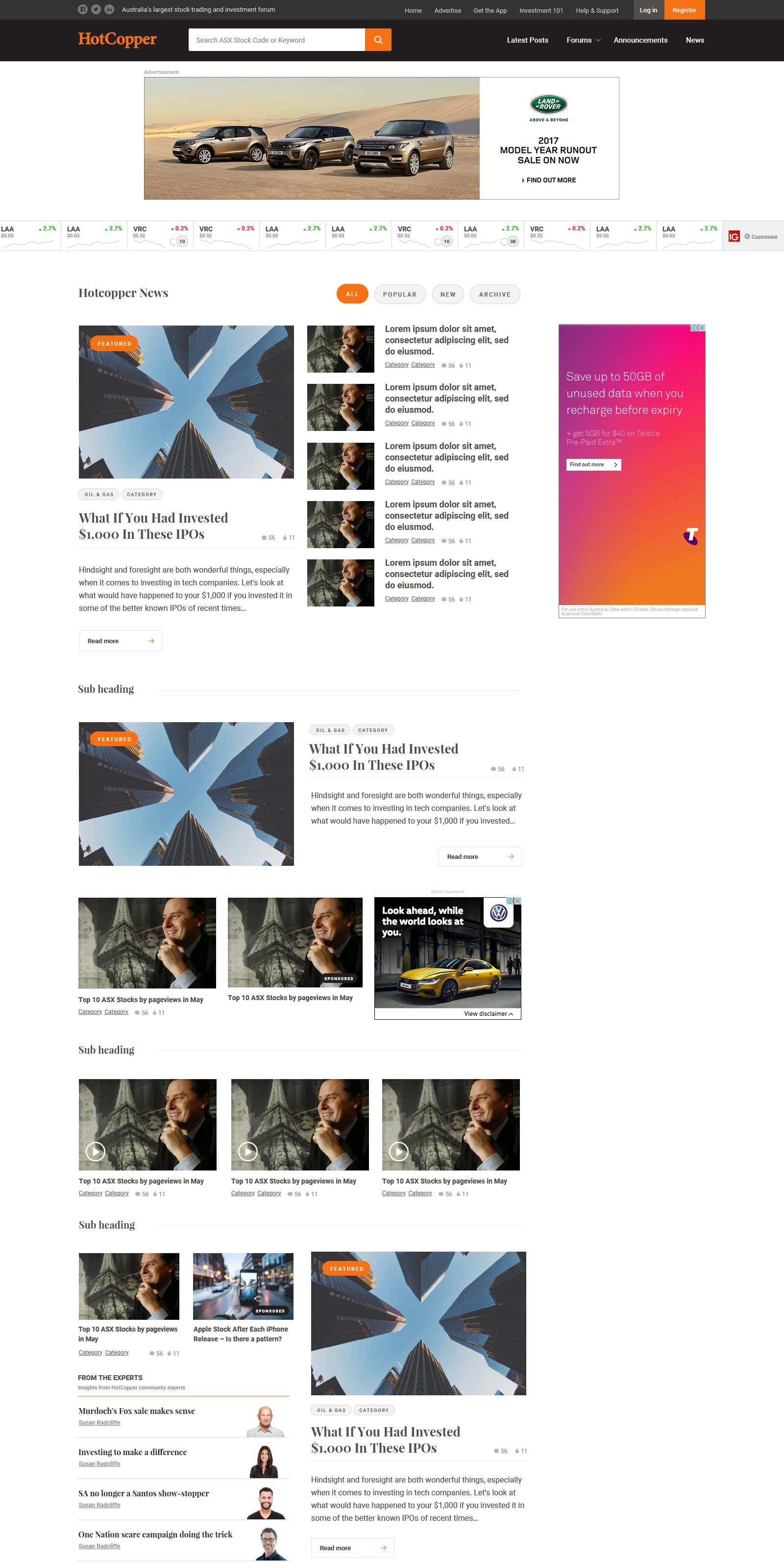
The client hoped to start generating editorial content. We designed a series of modular pages that allowed for a mix of text and video based media that conveyed a sophistication and trust as a source of news.
Component library
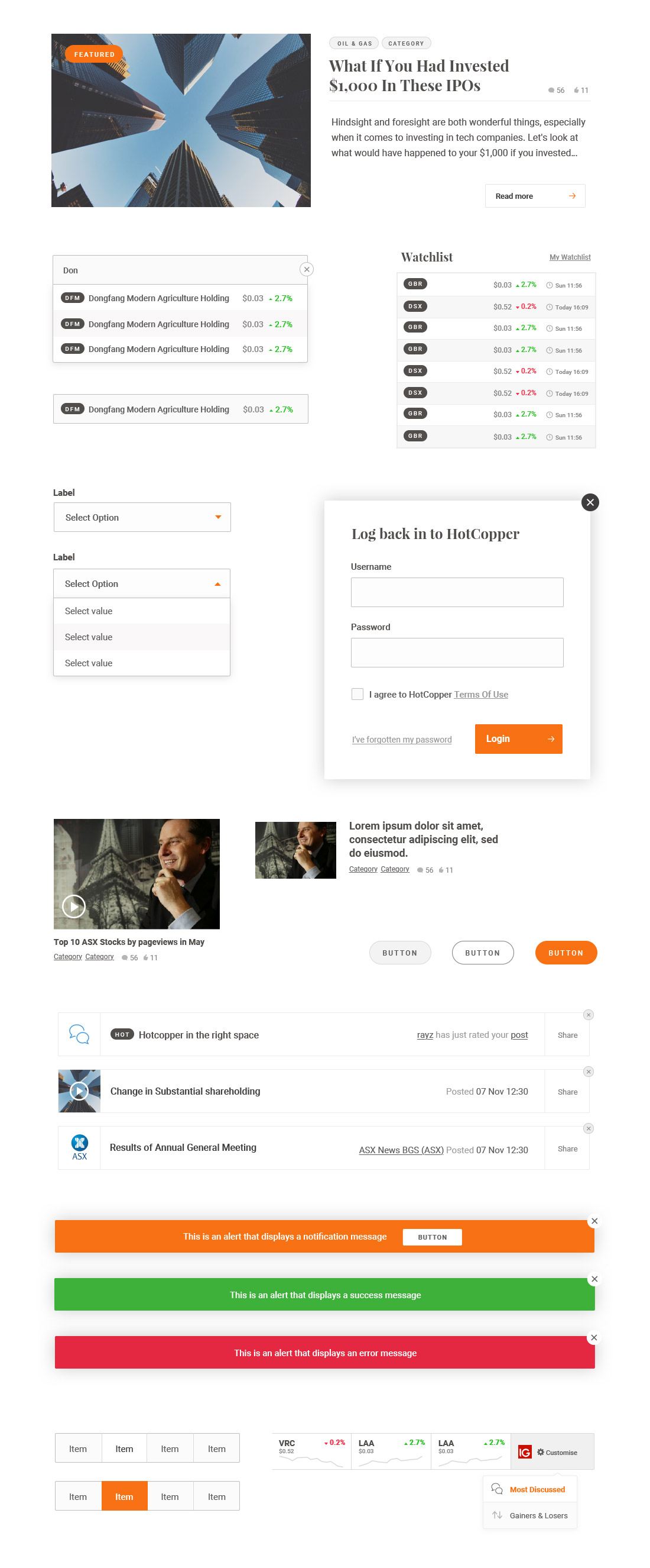
Part of the brief from the client was to establish a consistent and appropriate visual language for UI used within the site. A comprehensive list of components were designed with the intention that an in-house development team could follow our direction when building bespoke features in the future.
Outcome
The designs were handed over to the clients in-house developers with the intention of releasing beta access to a smaller user base for evaluation. Unfortunately we weren't involved in the implementation or pilot release.
If I could have done something differently I would have encouraged a more user centered design approach to this work, including usability testing post launch. Sadly, this isn't always possible in an agency context.