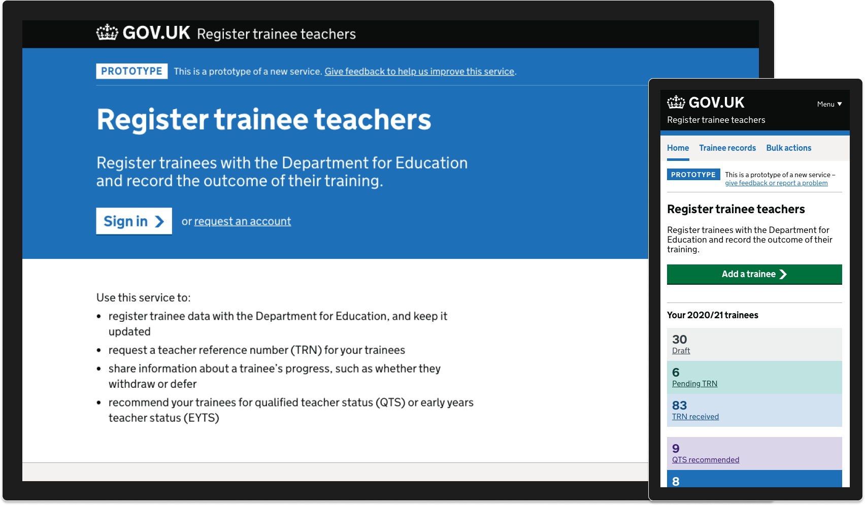
Register trainee teachers does what is says on the tin, register trainees with the Department for Education and record the outcome of their training. Teachers across England will have their progress tracked using this service.
Where we started
We were replacing a legacy product which was relatively new but not at all designed or developed with users in mind. The existing product was inaccessible, and users complained of usability issues.
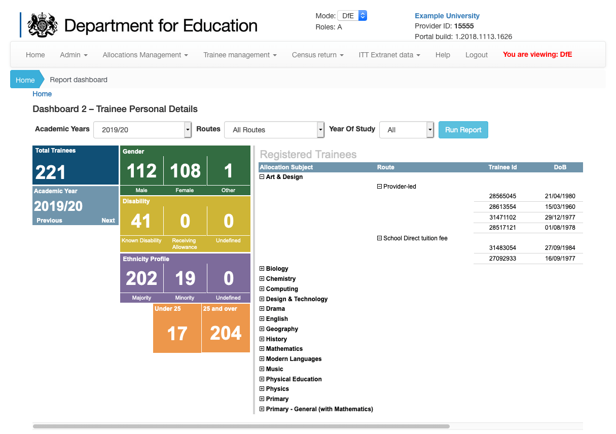
The product is essentially a CRM for trainee teachers, with user interaction largely focused on inputting data in forms. The original product had a number of issues:
- users were constantly being timed out
- a users progress wasn’t being saved
- iconography, language and error messaging was confusing
- forms were embedded within modals that presented significant accessibility challenges
User centred design
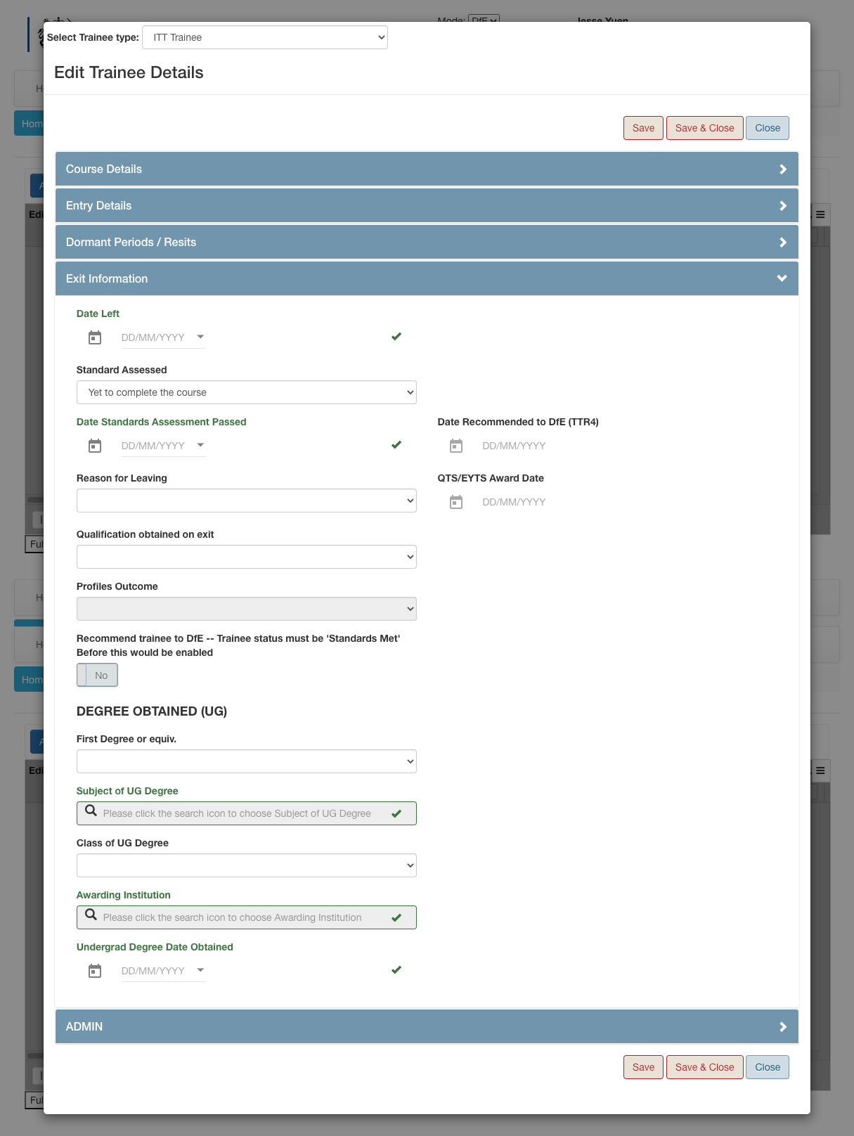
Working closely with user researchers on the team meant we could get into a rhythm of regular usability testing sessions, collaborative analysis, insight generation and iterative updates.
User needs define what we prioritise in design and what we ship first and there is no substitute for talking to actual users and observing them using the service.
Designing in flows
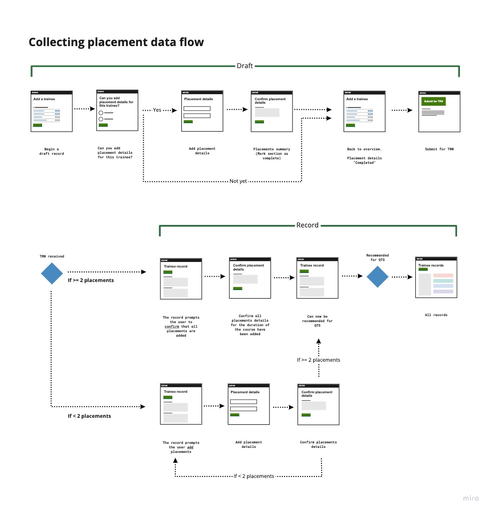
Some digital services are more transactional, with a relatively linear user journey. This service was far more complicated, where a trainee record may exist in the system for a number of years, meaning our users were required to return at multiple times to update data and complete tasks.
We mapped out complex parts of the user journey, allowing us to document the nuances around business rules.
Designing in code
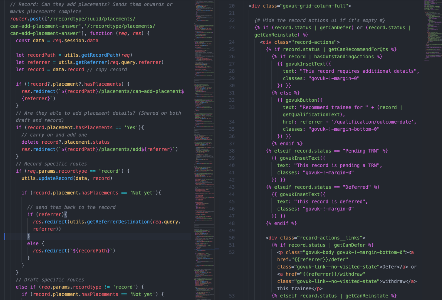
We designed this service exclusively in code, building a functional prototype using the GOV.UK Prototype Kit, and using components from the GOV.UK design system.
We produced a browser based prototype that looked, felt and most importantly worked like the real thing which allowed us to conduct detailed usability testing as well as provide a valuable resource for the development team to follow when moving our designs into production.
What we did
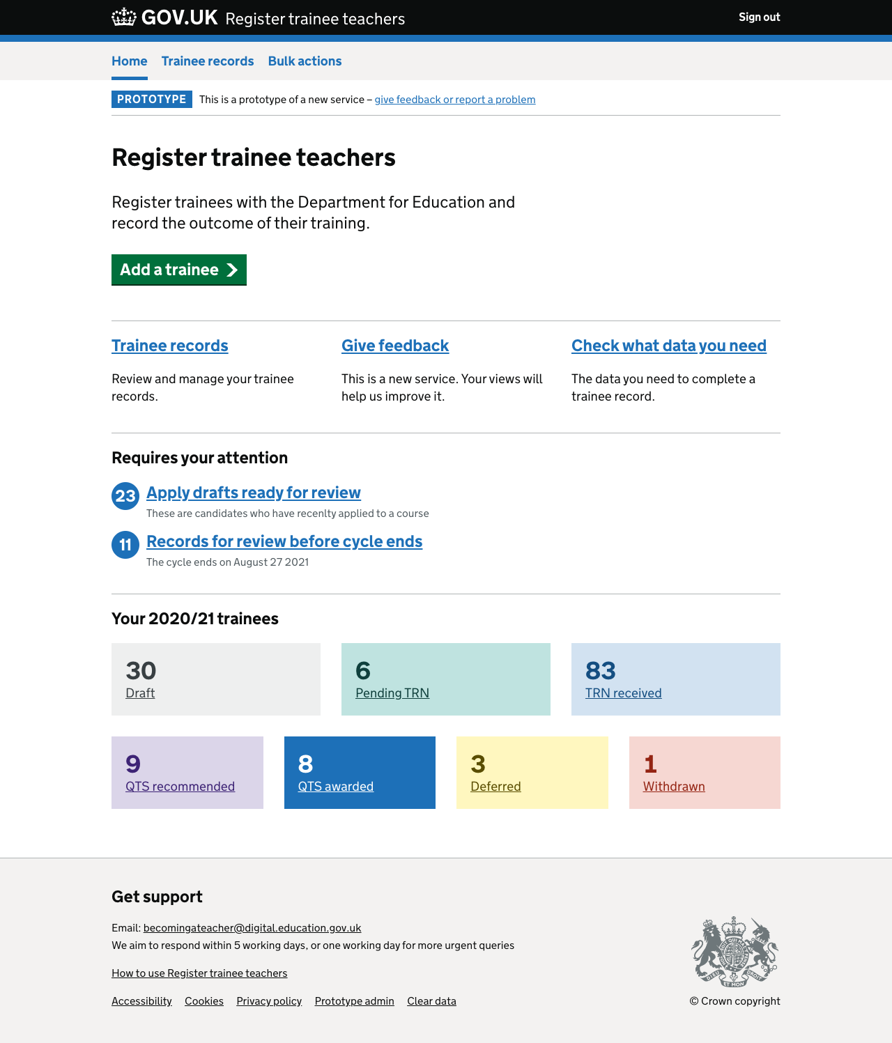
A simplified dashboard provided:
- a focus on the key data a user needed to know
- links to critical guidance and task that needed attention
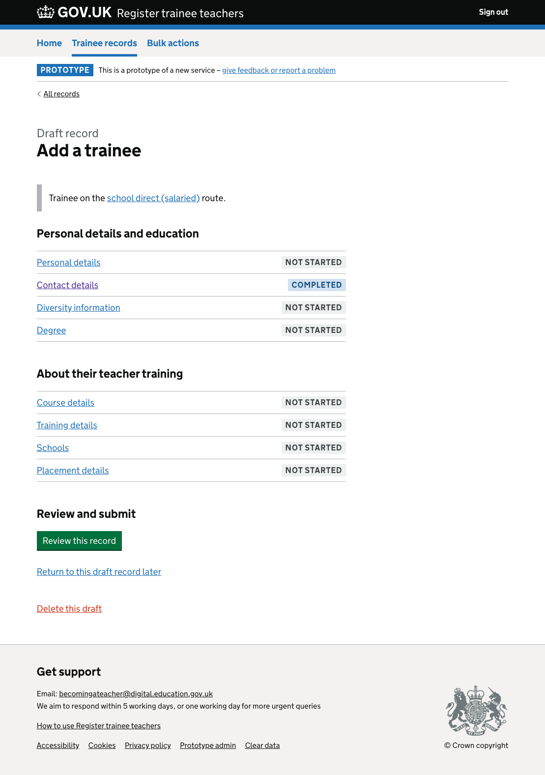
A significant issue with the existing tool was that users struggled to follow their progress when creating a record. The GOV.UK task list pattern helps “Task list pages help users understand: …the order they should complete tasks in and when they have completed tasks”.
This pattern addressed the user’s need for grouping related tasks and clearly signposting progress.
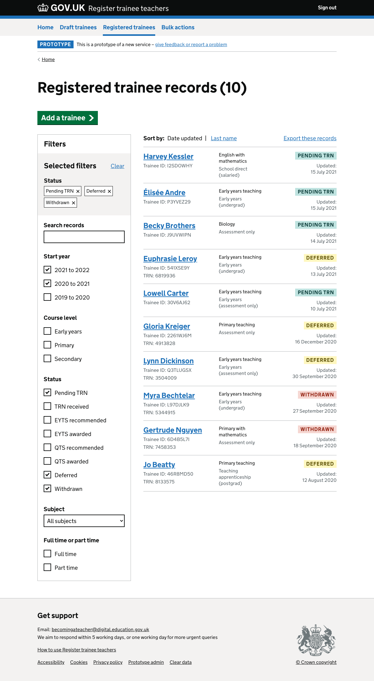
User needed to track multiple trainees over a number of years. Trainee records can exist in multiple states and there was a need to provide a clear classification system and advanced filtering.
Documenting design
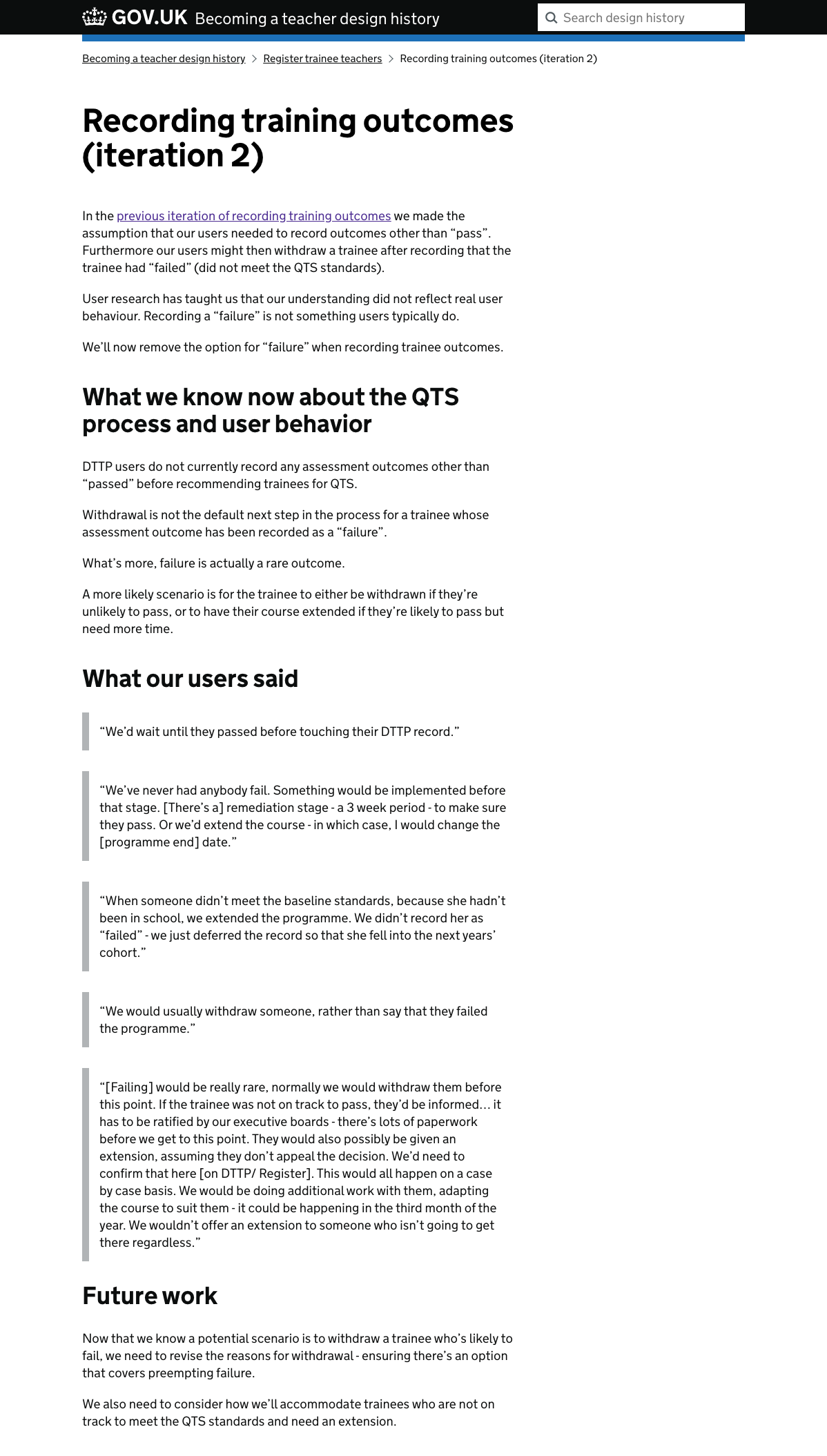
We frequently documented our design using a design history. The design history looks forwards and backwards, new posts show the team where the service is going and old posts tell us how we got to where we are now. It allows us to share what we learn with others and it ensures we’re being transparent and designing in the open.
Celebrating team milestones
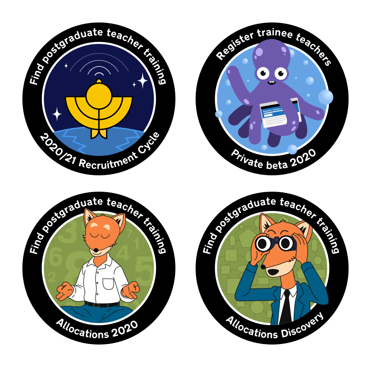
Some government digital service teams celebrate milestones with mission patches, a tradition that comes from the early space missions. I led our team in a team workshop to decide on our spirit animal and designed our mission patches. These were printed and then, as we are all remote, mailed across the country to the team.
Outcome
The private beta involved piloting the service with a sample group of live users before a public beta where the service was officially live.
In contrast to the legacy product, our service was significantly more usable and accessible. Time to create a record was a key metric we used to measure success. In the original product a record would take up to 20 minutes to create while we observed first time users creating records in 6-7 minutes.