Style guide

Everything that ships on this site — tokens, type, colour, patterns and components — rendered live from the same CSS the rest of the site uses. Written for humans and agents alike.

Colour

Every swatch below is painted with var(--token), so this page always shows the colour that is actually shipping. Source of truth: src/scss/utilities/_variables.scss.

Core palette

  • var(--color-highlight)

    #7a9676

  • var(--color-text-default)

    #fff

  • var(--color-text-alt)

    #fff

  • var(--color-text-alt2)

    #d9d7c9

  • var(--color-background)

    #fff

  • var(--color-background-alt)

    #30552f

  • var(--color-background-breakout)

    #3b5e3a

  • var(--color-background-selection)

    #f0f2f3

  • var(--color-base)

    #f8f8f8

  • var(--color-border)

    #4f694b

  • var(--color-light)

    #fff

  • var(--color-mid)

    #a3a3a3

  • var(--color-muted)

    #9eb395

Aliases

Semantic tokens that point at the palette. The --color-text-link-* and two --color-button-* tokens resolve to --color-brand-*, which is not defined anywhere — they are inert. Unclassed links actually use --color-text-alt2 (see Prose).

  • --color-text-link var(--color-brand-dark) → unresolved
  • --color-text-link-active var(--color-text-link) → unresolved
  • --color-text-link-focus var(--color-text-link) → unresolved
  • --color-text-link-hover var(--color-text-link) → unresolved
  • --color-text-link-visited var(--color-text-link) → unresolved
  • --color-input-background var(--color-background) → #fff
  • --color-input-background-hover var(--color-background) → #fff
  • --color-input-background-active var(--color-background) → #fff
  • --color-input-border var(--color-border) → #4f694b
  • --color-input-border-hover var(--color-border) → #4f694b
  • --color-input-border-active var(--color-mid) → #a3a3a3
  • --color-button var(--color-brand) → unresolved
  • --color-button-hover var(--color-brand-dark) → unresolved
  • --color-button-active #1aabeb
  • --color-button-border #059de1
  • --color-button-alt var(--color-base) → #f8f8f8
  • --color-button-hover-alt var(--color-mid) → #a3a3a3
  • --color-button-active-alt var(--color-base) → #f8f8f8
  • --color-button-border-alt var(--color-border) → #4f694b

Typography

Families

The quick brown fox jumps over the lazy dog

var(--font-family)

system, -apple-system, ".SFNSText-Regular", "San Francisco", "Roboto", "Segoe UI", "Helvetica Neue", "Lucida Grande", sans-serif

The quick brown fox jumps over the lazy dog

var(--font-family-serif) at var(--font-weight-serif)

"Bricolage Grotesque", system-ui, sans-serif — loaded from Google Fonts at weight 700 only. Used for large headings (page intros, work and section headings).

Weights

  • Aa — The quick brown fox

    var(--font-weight-light) 300

  • Aa — The quick brown fox

    var(--font-weight-default) 400

  • Aa — The quick brown fox

    var(--font-weight-semibold) 600

  • Aa — The quick brown fox

    var(--font-weight-bold) 700

  • Aa — The quick brown fox

    var(--font-weight-serif) 700

Type scale

Sizes step up inside @media (min-width: 75em) (1200px). The specimens below are set with font-size: var(--token), so resize the window to see the shipped ramp.

  • Drifting.

    var(--font-size-xxx-large) 7rem · 112px — from 1200px: 8rem · 128px

  • Drifting.

    var(--font-size-xx-large) 4rem · 64px — from 1200px: 5.5rem · 88px

  • Drifting.

    var(--font-size-well-large) 3rem · 48px — from 1200px: 4rem · 64px

  • Drifting.

    var(--font-size-x-large) 2.6rem · 41.6px — from 1200px: 4rem · 64px

  • Drifting.

    var(--font-size-large) 2rem · 32px — from 1200px: 2.6rem · 41.6px

  • Drifting.

    var(--font-size-medium) 1.8rem · 28.8px — from 1200px: 2rem · 32px

  • Drifting.

    var(--font-size-default) 1.4rem · 22.4px — from 1200px: 1.6rem · 25.6px

  • Drifting.

    var(--font-size-small) 0.833rem · 13.3px

  • Drifting.

    var(--font-size-x-small) 0.694rem · 11.1px

  • Drifting.

    var(--font-size-xx-small) 8px

Line heights

Text set at this line height wraps like this. The body ships at 1.4 via _typography.scss; these tokens are applied per component. Resize to check the rhythm across a few lines of copy.

var(--lineheight-text) 1.5

Text set at this line height wraps like this. The body ships at 1.4 via _typography.scss; these tokens are applied per component. Resize to check the rhythm across a few lines of copy.

var(--lineheight-heading) 1.3

Spacing

Each bar is sized with width: var(--token).

  • var(--spacing-xx-small) .125rem · 2px
  • var(--spacing-x-small) .25rem · 4px
  • var(--spacing-small) .5rem · 8px
  • var(--spacing) .75rem · 12px
  • var(--spacing-medium) 1rem · 16px
  • var(--spacing-large) 1.5rem · 24px
  • var(--spacing-x-large) 2rem · 32px
  • var(--spacing-xx-large) 3rem · 48px
  • var(--spacing-xxx-large) 4rem · 64px
  • var(--spacing-xxxx-large) 5rem · 80px
  • var(--spacing-mega-large) 7rem · 112px

Layout & breakpoints

Page scaffold

Pages are built from .wrapper (centred, max-width: var(--max-width), 140rem · 2240px) containing .grid-wrapper, which becomes a six-column grid from 600px. Content blocks are .grid-items placed with grid-column. Work case-study copy lives in .project__content, which spans four of the six columns on wide screens.

Breakpoints

  • 37.5em · 600px.grid-wrapper switches to six columns; wrapper padding steps up; work/skills section headings become sticky.
  • 50em · 800px.project-split forms two columns.
  • 75em · 1200px — type scale steps up (:root media override); project meta moves to its own column; .project-split stacks again through this band.
  • 100em · 1600px.project-split returns to two columns; the availability seal moves to the second-last column.

Width and grid tokens

  • var(--width-600) 37.5rem · 600px
  • var(--width-800) 50rem · 800px
  • var(--width-1000) 62.5rem · 1000px
  • var(--width-1200) 75rem · 1200px
  • var(--max-width) 140rem · 2240px
  • var(--grid-column-gap) 2vw
  • var(--grid-row-gap) 2vh

Motion

Duration tokens power transitions (link colour, image zooms, the availability seal spin). Hover or focus a chip to feel each duration — the background fade uses that token.

Prose

How markdown renders inside a work case study. This demo sits inside real .project .project__content wrappers, so what you see is exactly what ships.

Section heading (h2, serif)

Body copy at --font-size-medium with an unclassed link — colour --color-text-alt2, underline --color-highlight, and a highlight-block hover. Emphasis renders as italic and semibold-bold strong.

Subheading (h3)

Lists keep browser defaults inside prose:

  • First item
  • Second item

Blockquotes get a 5px --color-highlight left border and generous vertical margin.

Inline code like var(--color-highlight) renders as a bordered chip; fenced blocks share the same surface:

A fenced code block. Same chip surface, block-level, scrolls if it must.
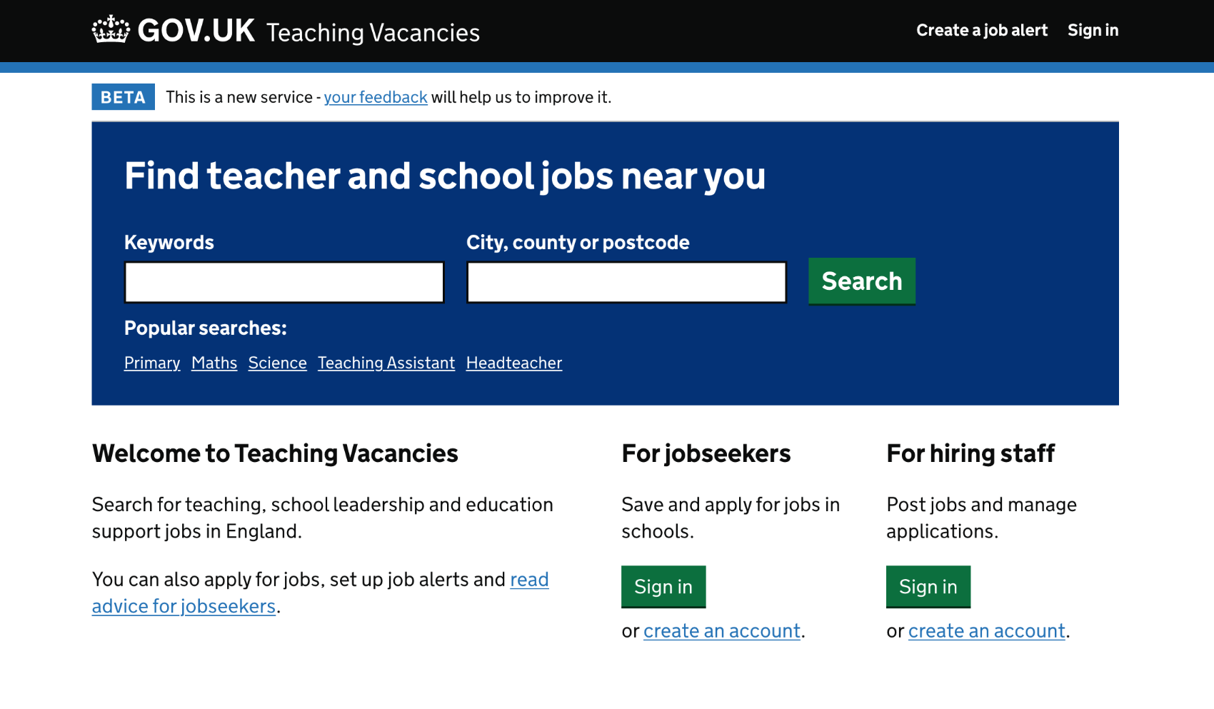
Teaching Vacancies job listing interface.
Figure captions are set in the mono stack at --font-size-default.
Markdown snippet
## Section heading

Body copy with an [unclassed link](/) and `inline code`.

> A pull quote or aside.

```text
A fenced code block. The language tag must be one Prism knows — use text as the fallback.
```

Components

Status badge

Pill for experimental or in-progress items. Rendered via the renderStatusBadge macro, which prepends screen-reader context. Compact variant is used on list cards.

Experimental or in-progress: Work in progress

Experimental or in-progress: Work in progress

Nunjucks snippet
{% from "partials/components/status-badge.njk" import renderStatusBadge %}
{{ renderStatusBadge({ text: "Work in progress" }) }}
{{ renderStatusBadge({ text: "Work in progress", compact: true }) }}

Project summary panel

Breakout panel on --color-background-breakout used for case-study intros and outros.

The gist

A short, self-contained summary of the case study — what the problem was, what shipped, and what changed for users.

HTML snippet
<section class="project-summary">
  <h3>The gist</h3>
  <p>One-paragraph summary of the case study.</p>
</section>

Project split

Two-column case-study block: media about two thirds, copy one third. Two columns from 800px, stacks through the 1200–1600px band while the main column is narrow, then splits again. --image-right flips the order. No blank lines inside the wrapper when used in markdown.

Teaching Vacancies job listing interface.
Optional caption

Image left. Media takes roughly two thirds of the row, copy one third.

Teaching Vacancies job listing interface.
Optional caption

Image right. Same ratio with the columns swapped.

HTML snippet
<div class="project-split project-split--image-left">
  <figure class="project-split__media">
    <img src="/images/example.png" alt="Describe the image.">
    <figcaption>Optional caption</figcaption>
  </figure>
  <div class="project-split__copy">
    <p>Copy for the narrow column.</p>
  </div>
</div>

Prompt compare

Side-by-side comparison table for prompts or copy variants, with row headers per section. When embedded in markdown, keep the whole block free of blank lines or markdown-it closes the HTML block early and re-parses the contents.

Example comparison: initial versus refined prompt.
SectionInitial promptRefined prompt
Prompt
You are a helpful assistant.
Write a job listing.
You are an expert coordinator.
Write a job listing in Australian English.
Use plain text. No em dashes.
Model output

Generic listing that misses the tone of voice.

Warm, specific listing in the right voice.

HTML snippet
<div class="prompt-compare-wrap">
  <table class="prompt-compare">
    <caption class="visually-hidden">What is being compared.</caption>
    <thead>
      <tr>
        <th scope="col"><span class="visually-hidden">Section</span></th>
        <th scope="col">Column A</th>
        <th scope="col">Column B</th>
      </tr>
    </thead>
    <tbody>
      <tr>
        <th scope="row">Prompt</th>
        <td><pre class="language-text"><code class="language-text">Prompt text…</code></pre></td>
        <td><pre class="language-text"><code class="language-text">Prompt text…</code></pre></td>
      </tr>
    </tbody>
  </table>
</div>

Availability seal

Spinning starburst pinned to an intro grid cell on the about page. The seal rotates over 60 seconds, spins up on hover or focus, and honours prefers-reduced-motion. The demo box below stands in for the grid cell it normally pins to.

HTML snippet
<aside class="grid-item available-badge">
  <a class="available-badge__motif" href="mailto:you@example.com" aria-label="Available for work">
    <div class="available-badge__spin" aria-hidden="true">
      <svg class="available-badge__shape" viewBox="0 0 200 200" focusable="false">
        <path fill="currentColor" d="…starburst path…"/>
      </svg>
    </div>
    <span class="available-badge__copy">Available<br />for work!</span>
  </a>
</aside>

Global chrome

The navigation, page intro and footer aren’t duplicated here — the live versions frame this very page. The intro pattern (partials/components/intro.njk) is the serif heading and blurb at the top; the footer shows the contact list and acknowledgement styles.

Notes for agents

  • Tokens are defined once, as CSS custom properties, in src/scss/utilities/_variables.scss. This page reads that file at build time (src/_data/designTokens.js) and paints with var(), so it cannot drift from shipped CSS.
  • There is no root font-size override: 1rem = 16px everywhere.
  • Styles compile from src/scss/global.scss only. Partials in src/scss/components/ that are not in its import list (for example _form.scss, _button.scss, _pagination.scss) do not ship — check the import list before documenting or reusing a class.
  • Markdown (markdown-it) runs with html: true and typographer: true, and indented code blocks are disabled — always use fenced blocks. Fence language tags must be languages Prism recognises; use text as the fallback or the build fails.
  • Raw HTML blocks in markdown (project split, prompt compare) must not contain blank lines — markdown-it ends the HTML block at the first empty line and re-parses what follows.
  • Prose components (project-split, prompt-compare, code chips) are scoped to .project__content and expect that ancestor.
  • The --color-text-link-*, --color-button and --color-button-hover tokens reference undefined --color-brand-* values and are inert; don’t build on them.
  • All examples on this page render inline in the document — no iframes — so component queries against this URL see real, final markup.