Senior Product Designer
Product Manager x 1, Engineering x 5
The context
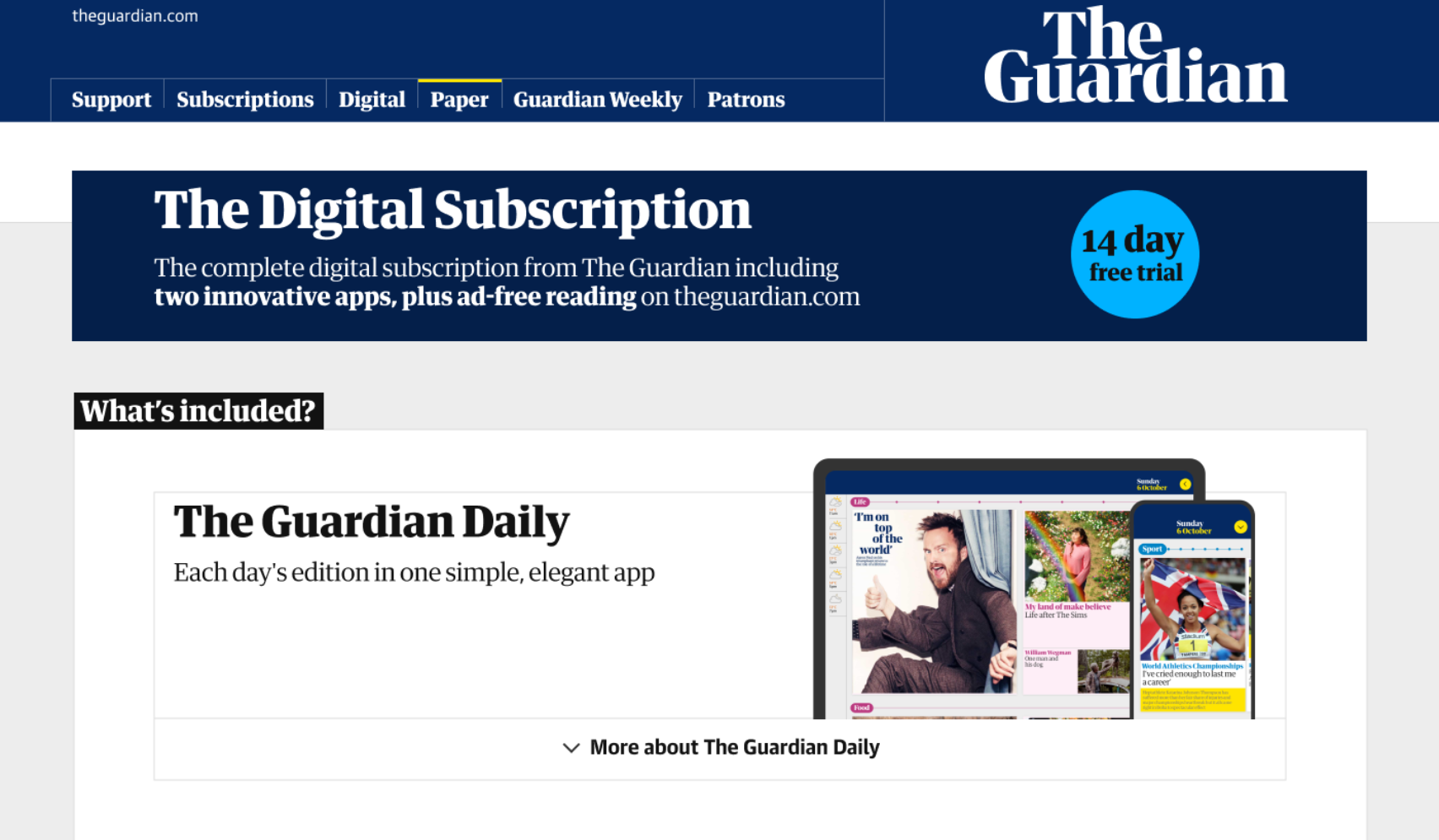
The intention of this work was to increase the visual maturity of the subscription platform. We revisited the entire journey from customer engagement, to 'storefront', checkout and beyond.
Where we started
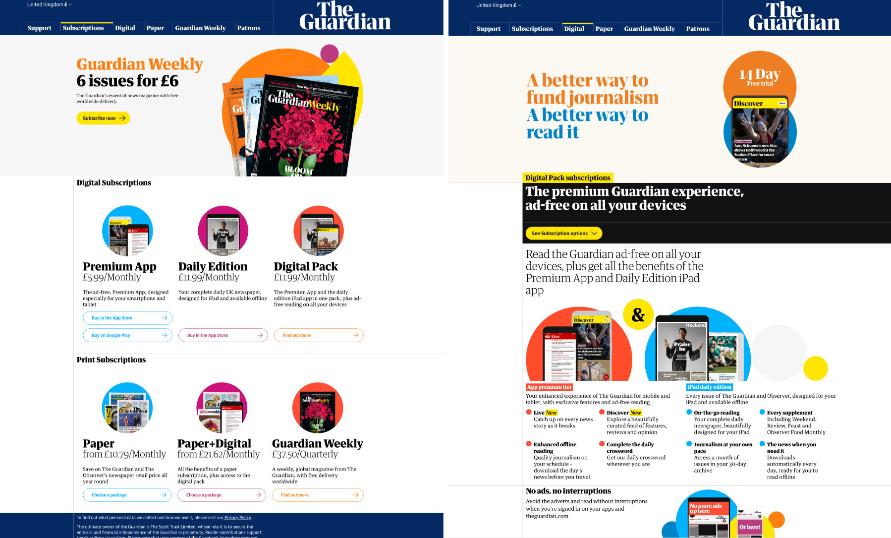
Circles… everywhere. The visual aesthetic of the subscription platform had drifted towards a colourful and playful tone. It had suited The Guardian at an earlier time but there was a desire to move towards a more mature, modular and unified design language across our products.
Wireframing
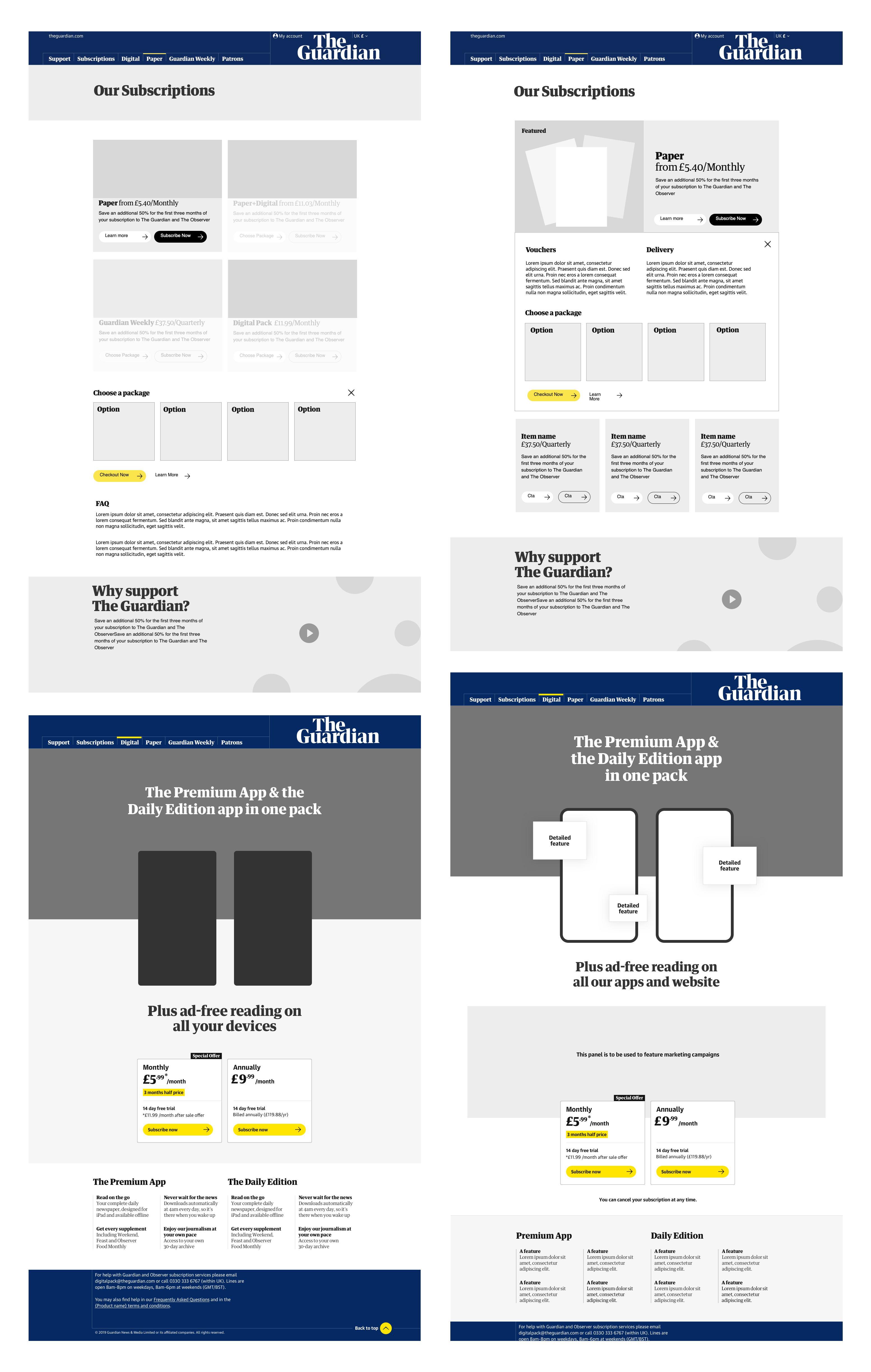
Designing at varying levels of fidelity allowed us to quickly explore and communicate ideas within the team and with our stakeholders. I’ll confess I can’t find many of the wireframes from this project but believe me, there were loads.
Components, patterns and templates
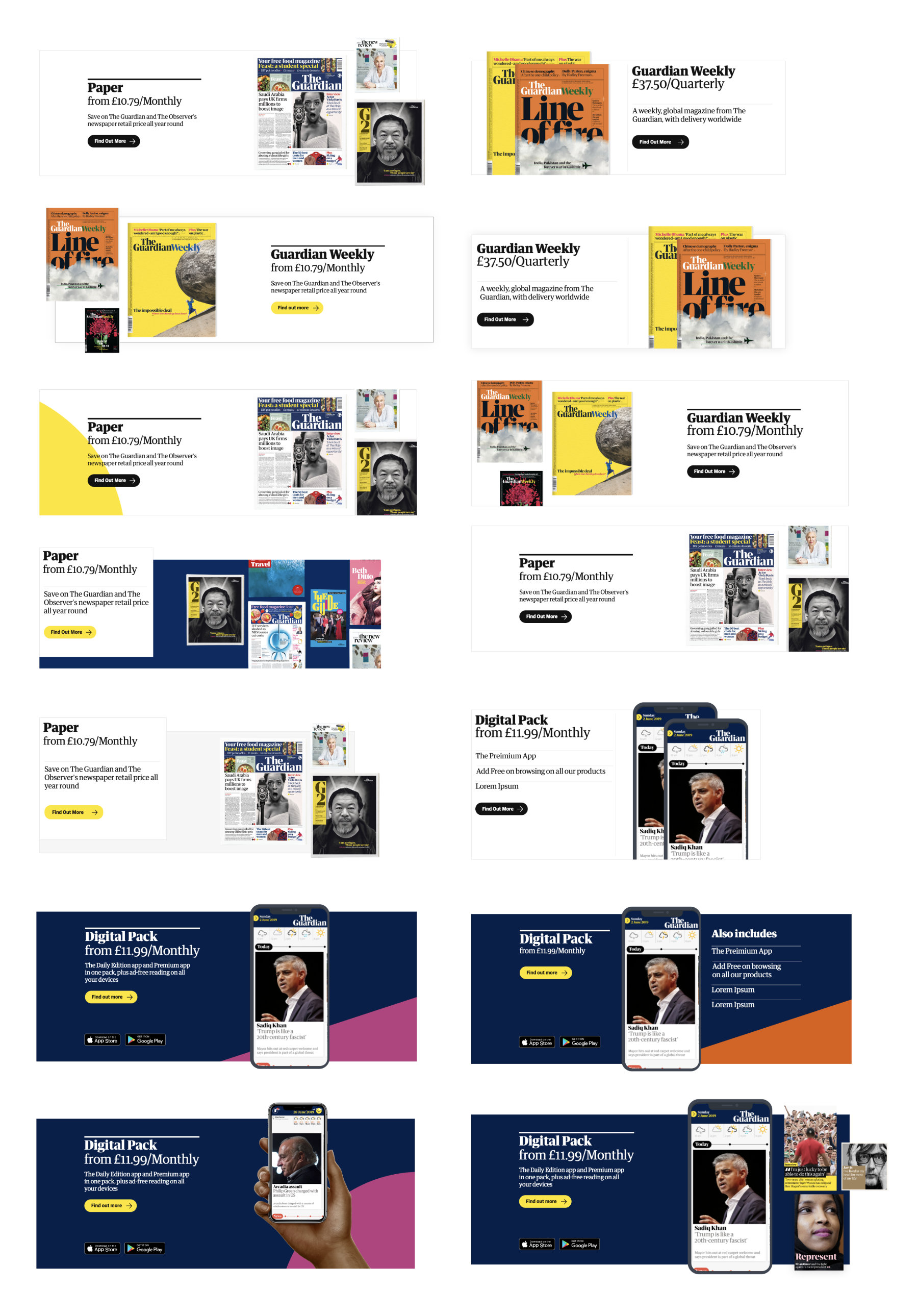
We had a consistency problem. Each page in the subscription site was unique, we had no shared components, no visual or structural commonality that could both unify the browsing experience or allow the product team to quickly assemble new pages and update existing ones.
We wanted to design a collection of modular components that were flexible enough to accommodate all of our products. The components combined would form patterns that would be the basis of consistent page templates across the site.
Prototyping in code
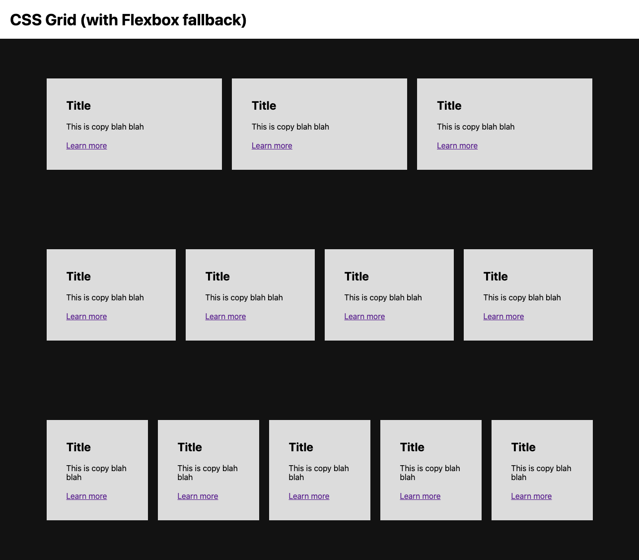
Communicating responsive layout behaviour to the development team is a challenge when working with static Figma assets. I prototyped a grid system to help communicate the requirements for our new pages. This particular grid system utilised css grid with flexbox fallback for older browsers. Visit the prototype.
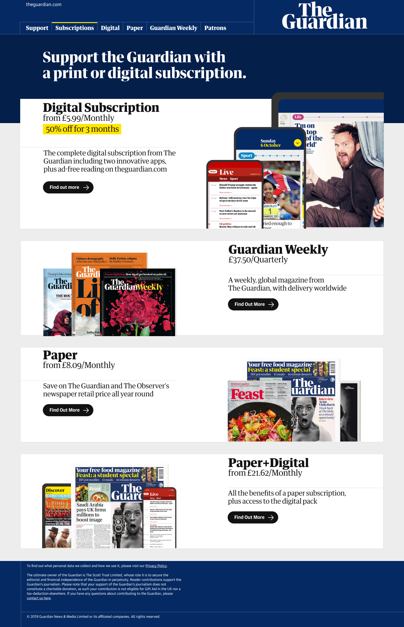
A modular approach
The modular landing page meant we could show/hide and highlight different products based on region.
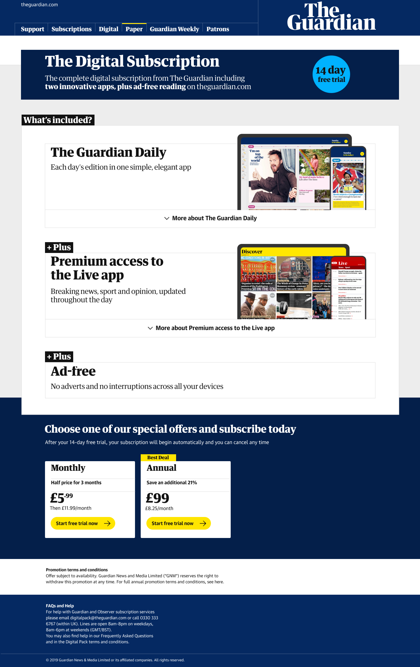
I designed a product page template that we could use across our entire product range. The product card itself was versatile and as it was brand new, we had the chance to bake more accessible goodies into it.
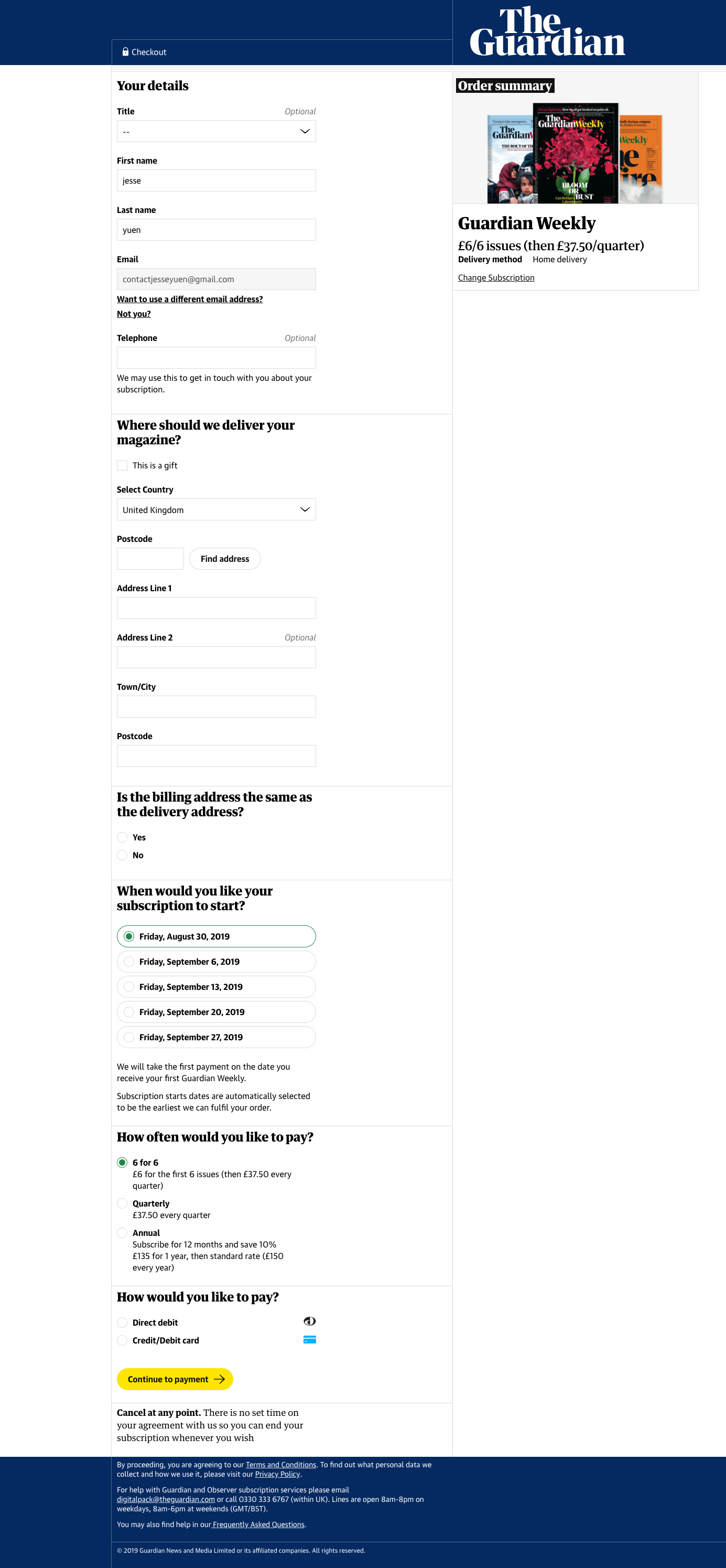
I designed a new checkout flow that resulted in a more accessible experience that ensured more customers successfully completed the subscription funnel.
Part of The Guardian’s strategy is emotional engagement with their audience. A section of the subscription site was there purely for good old-fashioned emotional manipulation in an editorial style.

Measuring success
We conducted usability testing on Axure prototypes of the user journey, as well as with assistive technology users (screen readers and magnifiers etc) in the research lab.
AB tests were also conducted with updated designs against the original controls, with new pages all performing better.
Outcome - revenue growth!
This work was part of a successful strategy to increase subscriptions and significantly helped shift the dial.
📈 Digital subscriptions up 39% year on year
📈 61% digital reader revenue growth year on year